
Why Great Posts Get Ignored (and How Visuals Fix That)
You write great content. Let’s make sure people actually stop to read it.

Welcome to the AI Marketing Playbook!
In this post, I’m focusing on one tool, Napkin.ai, because it has a 20% discount for my subscribers (this is not a sponsored post, just a thoughtful gesture by a fellow Substack member to share her code).
I used to spend hours writing posts I was proud of. Every idea felt sharp, every sentence flowed. But when I hit publish, they barely got noticed.
It wasn’t the idea that failed. It was how it looked. Most people don’t read deeply anymore. They scan, pause for a second, and move on. I realized attention today is earned visually. 👀
That’s when I started turning my words into simple visuals — fast, clean, and designed to make people stop and actually read.
“Visual content is 40× more likely to get shared than non-visual content.” - WebFx
Why Your Blog Posts Often Go Unnoticed?
Many great posts disappear in the noise, not because they lack insight, but because of how they’re presented. This visual, created in Napkin, breaks down the common reasons behind low engagement.
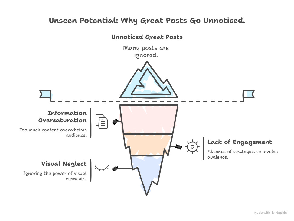
Most content gets ignored, and the data makes it clear why:
Information Oversaturation: Over 90% of content goes unread on the internet because there’s more produced than readers can consume.
Visual Neglect: Visual content is processed 60,000 times faster by the brain than text, yet many posts still rely on long paragraphs alone.
Lack of Engagement: Blog posts with infographics generate 178% more inbound links than standard posts.
Once you recognize these barriers, you can design your content to stand out. As I shared in my earlier posts as well, AI can help you create scroll-stopping marketing visuals.
How I Turn Words into Visuals in Less than 2 Minutes?
There are plenty of AI tools that can turn ideas into visuals, like Canva Magic Studio, Tome, Gamma, and Beautiful.ai.
They’re all useful in their own way, but what makes Napkin unique is that it instantly creates visuals from the text you provide — no prompts needed.
Here’s how to use it:
1. Write or paste your text
I start with a single thought, sentence, or quote that I want to visualize and drop it into Napkin. Sometimes, I even use a full blog heading to create a visual or infographic from it.
2. Generate visuals instantly
With one click, it creates clean, thoughtful visuals that match the tone and intent of what I wrote. The best part is that it gives me multiple options to choose from, so I can pick the one that fits best.
3. Edit and fine-tune
I can adjust icons, colors, and layouts in seconds, which keeps the creative flow natural and smooth.

4. Export and share
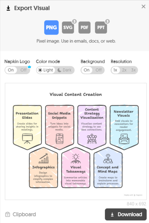
Once I’m happy with the result, I export it as an image, PDF, or slide and include it in my blog or newsletter.
In less than two minutes, an idea that started as plain text becomes a visual that speaks for itself, simple, clear, and ready to engage.
If you’d like to try it, you can get 20% off on Napkin’s Plus and Pro plans. Just use the coupon code PRNOTES during checkout, valid until October 31, 2025. Thanks to Elena Calvillo for sharing this code!
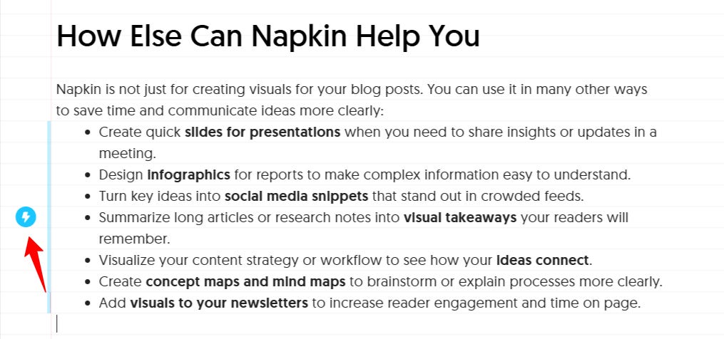
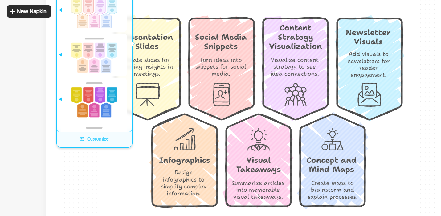
What are the Other Ways Napkin Can Help You?
Napkin is not just for creating visuals for your blog posts. You can use it in many other ways to save time and communicate ideas more clearly:
📊Create quick slides for presentations when you need to share insights or updates in a meeting.
📈Design infographics for reports to make complex information easy to understand.
📱Turn key ideas into social media snippets that stand out in crowded feeds.
🧠Summarize long articles or research notes into visual takeaways your readers will remember.
🗂️Visualize your content strategy or workflow to see how your ideas connect.
🗺️Create concept maps and mind maps to brainstorm or explain processes more clearly.
💌Add visuals to your newsletters to increase reader engagement and time on page.
Each of these uses helps you share information faster, make ideas more memorable, and give your content a polished, professional edge.
This could even be a great way to start your own side hustle with AI. You can offer content creation services to clients and help them create blogs with engaging visuals.
“~95.2% of marketers say visual content is important to their strategy.” - Adam Conell
How Much Does Napkin Cost?
Napkin offers three plans to fit different creative needs.
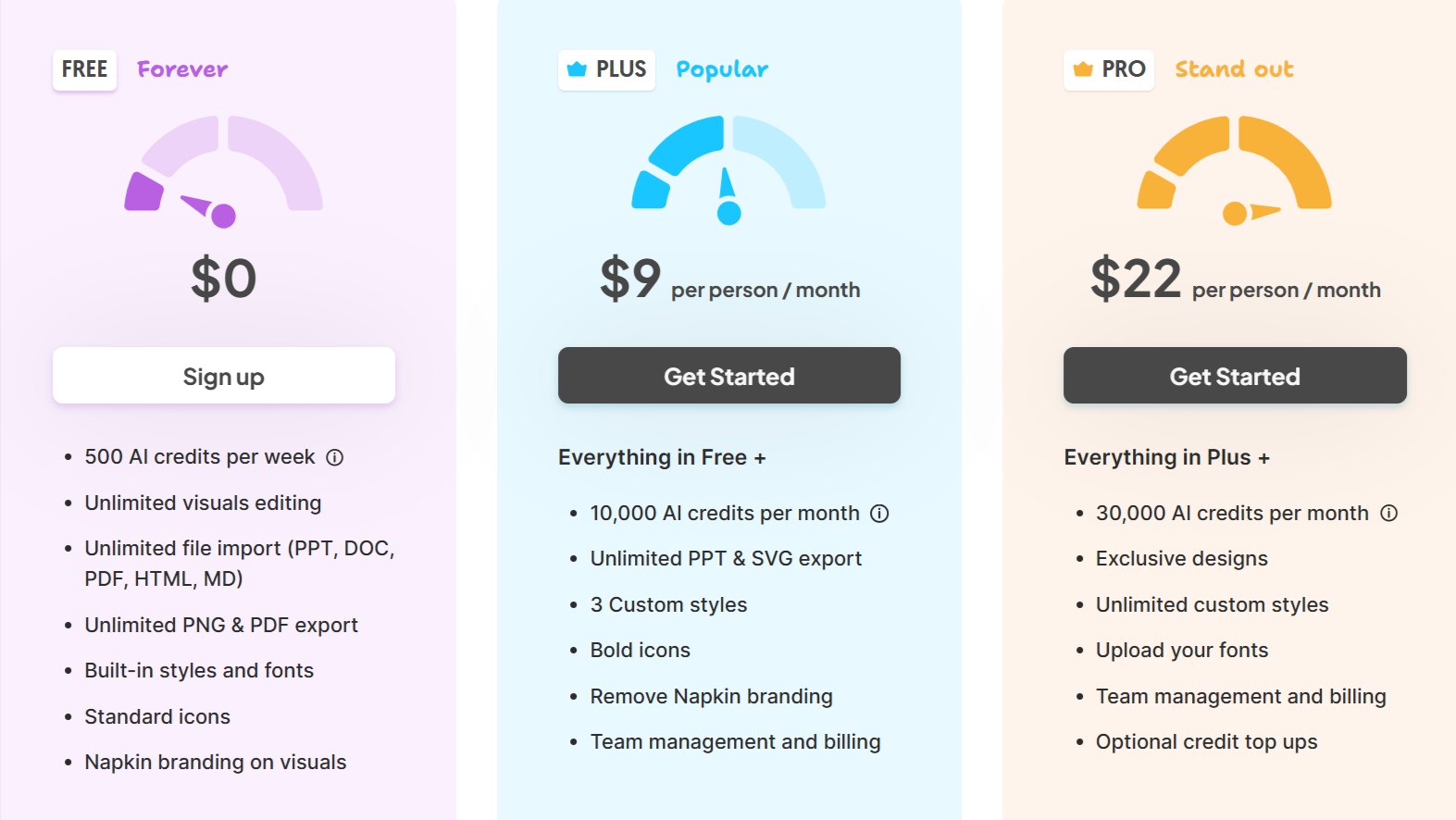
The Free plan gives you 500 AI credits per week, unlimited editing, and basic export options, perfect if you’re just getting started.
The Plus plan costs $9 per person per month and includes everything in Free, along with 10,000 monthly AI credits, custom styles, bold icons, and the option to remove Napkin branding.
For teams and power users, the Pro plan at $22 per person per month adds 30,000 AI credits, exclusive designs, unlimited custom styles, font uploads, and advanced team management.
Why Should You Add Visuals to Your Blog or Newsletter?
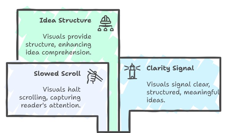
Readers don’t move line by line anymore. They scan, pause, and decide in seconds whether your idea is worth their time. Visuals act as anchors in that moment. They make people stop and pay attention.
“Articles with images get 94% more views than articles without. ” - Hubspot
When you add a visual that captures the essence of your message, it does two things. It slows the scroll and signals clarity. It tells the reader that your idea has structure and meaning.
What Results Can You Expect from Using Visuals?
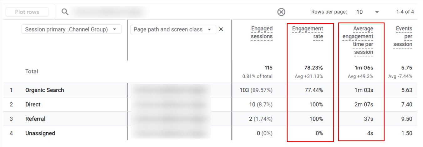
Since I started adding visuals to my posts, both the engagement rate and engagement time have noticeably increased.
Readers spend longer on the page, interact more with the content, and are more likely to share it. That kind of engagement sends all the right signals to search engines — it’s good for SEO and audience growth.
I’ve also noticed something unexpected. People often save my visuals for reference or even embed them in their own blogs, linking back and giving credit.
Each share creates a ripple effect, more visibility, more backlinks, and more reach without any extra effort.
Final Thoughts
Great writing deserves to be seen, not just read. Adding visuals is not about decoration, it is about communication. When readers pause, engage, and remember your ideas, that is when your content truly works.
If you have not tried visual storytelling yet, start small. Turn one idea, one quote, or one insight into a visual and share it. You will be surprised how quickly people connect with it.
Absolutely spot on! Nowadays, people don’t just read text; they stop and engage when content is visual. Tools like Napkin.ai are really helpful for saving time and making your content more engaging. I’m impressed by your smart work!
Thanks for sharing this. Have been using Napkin since they were in Beta and absolutely loving it!